How can we help?


The Engagement 4Cast
We recently worked on a project for Healthy Child, Healthy World (HCHW) to help improve the usability and design of their Salsa donation pages. With end-of-the-year fundraising drives coming up, making even small tweaks to improve usability of these campaign pages can go a long way in increasing conversion rates.
Here are three improvements we made to the donation pages that you can adopt on yours today!

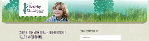
One of the most apparent changes that could be made to the HCHW donation pages was decreasing the amount of space at the top of the page. We worked with another client earlier this year to do some landing page testing and optimization, and through those tests found a slightly higher performance on pages with narrower header regions.

You should also minimize the number of opportunities that users have to get distracted from taking action. Eliminating website navigation from key landing pages can increase conversion rates, as people will be less likely to click away from the page and not find their way back.
Some users do not need to read the content on your landing page before they take action. They read your email, they are ready and engaged. Get them to your form as quickly as possible.
By bringing your form higher up on the page, you put the opportunity to get involved right in front of your supporter. We achieved this for HCHW by using a two column layout, with the content aligned to the left, and donation form to the right. We learned in past optimization tests that this common layout outperformed others we have tried, but definitely experiment with various layouts to learn what works best for you.
People are visual creatures. Our eyes are immediately attracted to elements of a page that stand out. Design techniques like encapsulation are commonly used by artists to draw the eye of a person to a particular part of a picture or other work of art they want them to focus on. These same design techniques can be used to draw your supporters eye to the areas you want them to focus their attention on.

We, with some simple CSS, turned the one-time and monthly giving toggles, and the donation amount radio buttons, into more interactive elements that drew more attention and are easier to click on a desktop or mobile device.
Below are full images of the old and new donation pages. What other design tweaks have you made to your Salsa donation pages to improve the user experience and drive up conversion rates?


4Site Studios is a talented troupe of web professionals who are passionate about creating tools to support digital marketers. We love to hear from our community! Reach out to us with your thoughts and questions. And don’t forget to subscribe below to get notified when we post new blogs – no spam, just content👍🏼
Subscribe to the Engagement 4Cast.